
A website losing to Instagram
Happy Gardens of Austin is a landscape design business run by Hanna. She knew her website wasn’t serving her. Most of her business was coming from Instagram, and the site that should have turned interest into consultations mostly didn’t.
I worked on the redesign with three other UX designers: Zoe, Casey, and Lauren. We had three weeks.
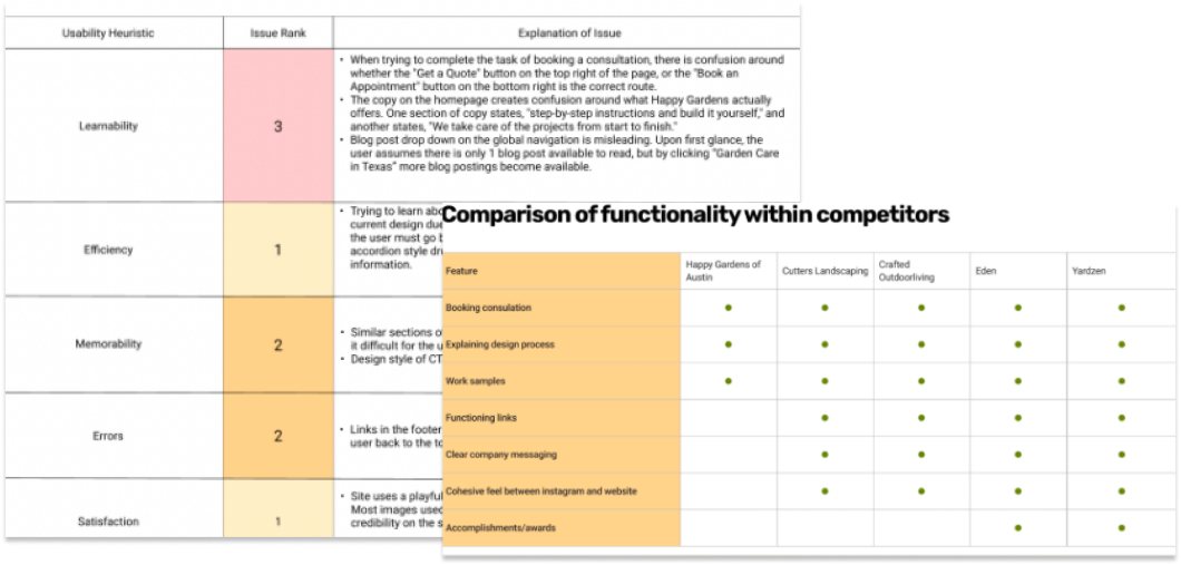
We started with a heuristic evaluation of the existing site. Its most serious problems were about learnability:
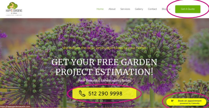
- Three competing ways to get in touch. A “Get a Quote” button, a large phone number, and a floating “Book an appointment” widget. Visitors couldn’t tell which one was the right way to start.
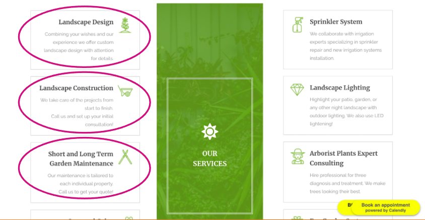
- Contradictory copy about what the business does. One section offered step-by-step instructions to build a garden yourself. Another promised “We take care of the projects from start to finish.”
- Navigation that misled. The blog menu suggested there was only one post until you clicked into it.
Testing the hypothesis
The evaluation gave us a hypothesis: the content, and the way it was organized, was the problem. We ran four moderated usability tests on the existing site to check it.
The tests confirmed it. The messaging was chaotic and unclear, and people came away with the wrong idea of what Happy Gardens actually provided. That confusion came partly from differing versions of the services copy, and got worse depending on where and when a visitor ran into each version.
We also ran a competitive analysis of four other landscape businesses: Cutters Landscaping, Crafted Outdoor Living, Eden, and Yardzen. Two patterns stood out, and both were missing from Happy Gardens:
- The “puzzle pieces”: our name for a numbered list of process steps, ending with a description of what the client receives.
- A portfolio of past projects, presented as case studies.
The problem was the content, not the look
A visual refresh alone wouldn’t have fixed anything. Visitors couldn’t find the information they were looking for, and when they did, it didn’t clearly say what Hanna does.
We designed for Johnny, a 41-year-old business analyst who wants to create a backyard he loves but feels overwhelmed by landscaping and can’t put his ideas into words. He doesn’t need a catalogue of services. He needs someone to guide him through the process.
Rebuilding the structure
We reorganized the site around three questions a visitor like Johnny has: How does this work? What have you done? Who are you?
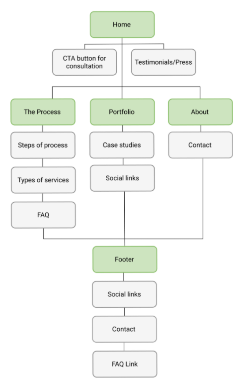
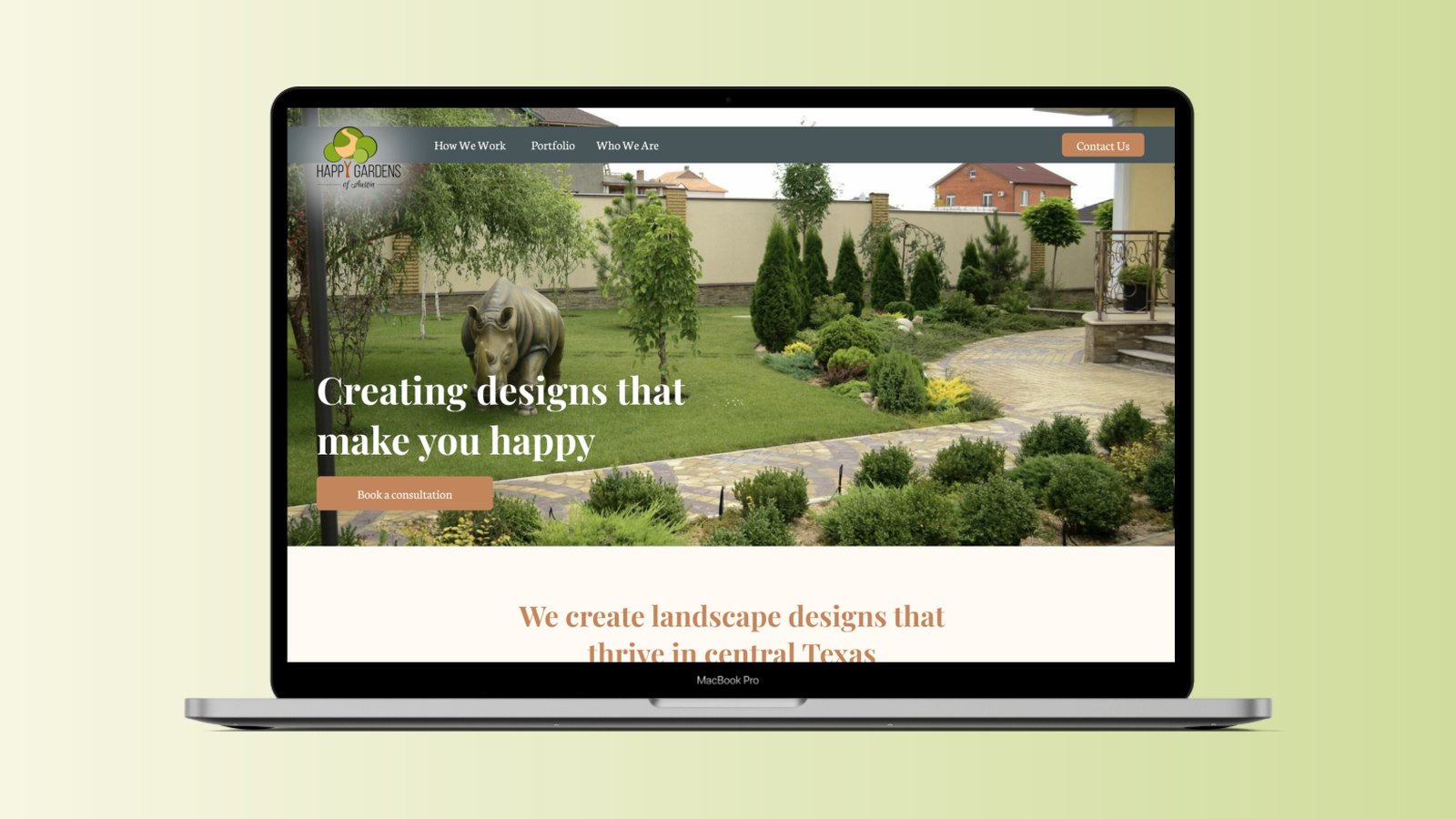
- A process page. Hanna’s biggest frustration was that people who contacted her didn’t understand what her process involved. The new “How We Work” page is the puzzle pieces from our research: four numbered steps, from the first consultation to the final design, followed by an FAQ.
- A portfolio. Past projects presented as short case studies with before and after photos, linking out to her Instagram. Her strongest sales channel became part of the site instead of competing with it.
- No blog. It was the biggest content change. Poorly organized, rarely updated, and rarely visited, it made the business look less active than it was.
The navigation went from six items (Home, About, Services, Gallery, Contact, Blog) to three (How We Work, Portfolio, Who We Are), plus a single “Contact Us” button.
Decisions I'd defend
- Cutting the blog
- It was poorly organized, rarely updated, and rarely visited. A stale blog costs a small business more credibility than having none.
- A process page instead of a list of services
- People who contacted Hanna didn't know what working with her involved. Four numbered steps answer that before the first call.
- One clear call to action
- The old homepage offered three competing ways to get in touch. The redesign leads with one, "Book a consultation."
- Built from the existing brand
- We kept Hanna's greens and added terra cotta and cream, rather than inventing a new identity her Instagram wouldn't match.
From wireframes to high fidelity
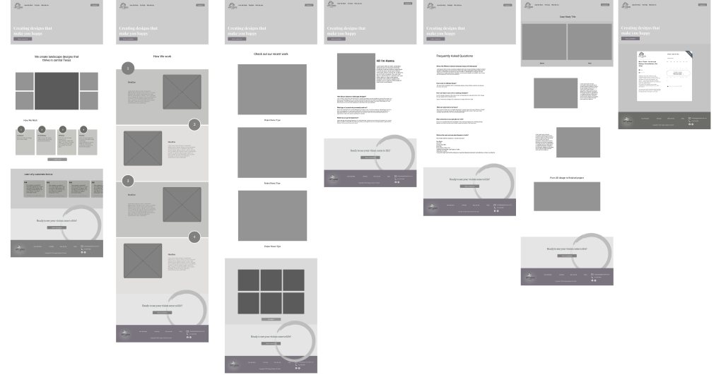
Once we knew where content would live, we laid out each page as a wireframe.
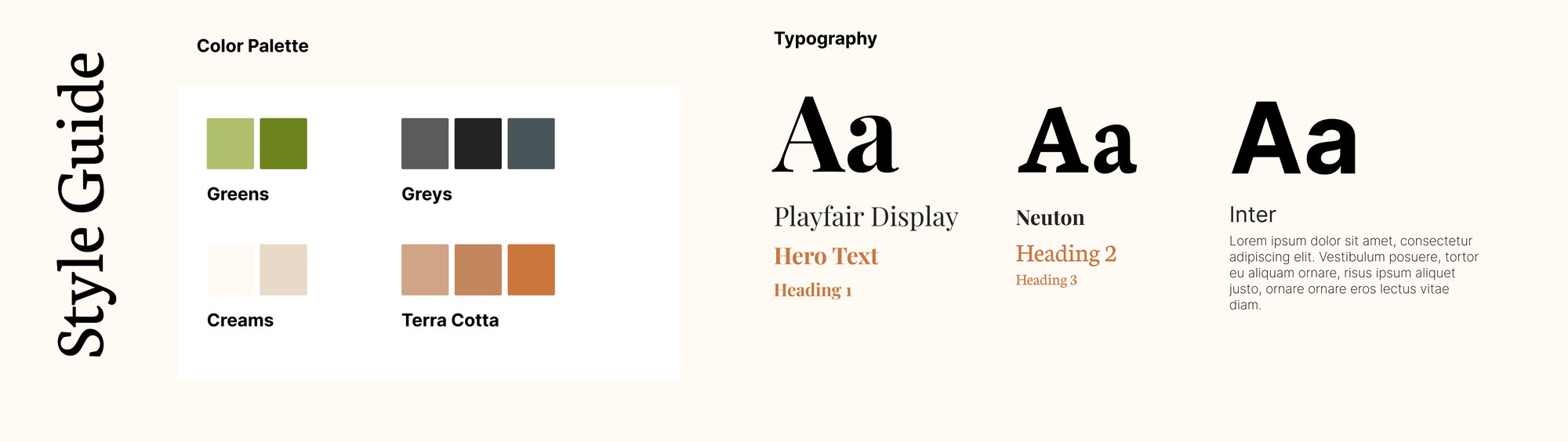
For the visual style, we looked at competitors and at the brand colors Hanna already used. We kept her greens and added terra cotta, cream, and slate grey, with Playfair Display and Neuton for headings and Inter for body text.
What we delivered
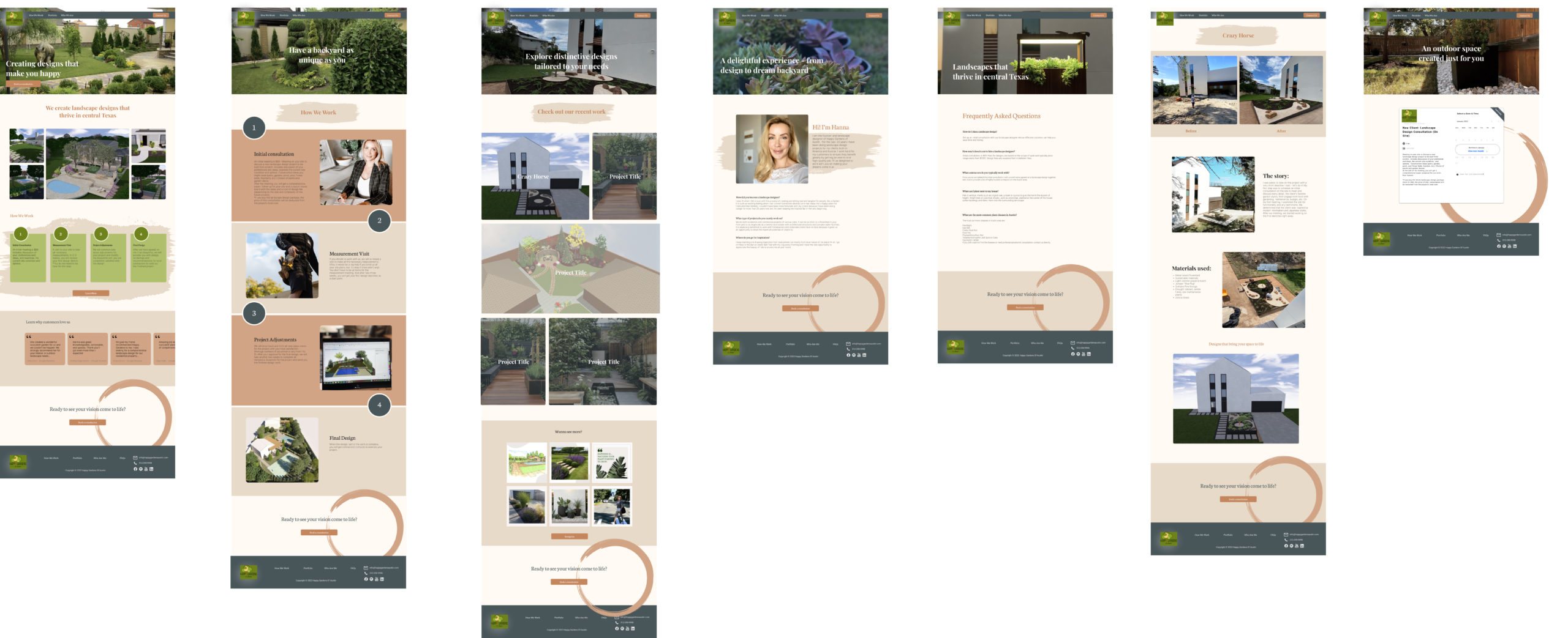
We delivered a clickable high-fidelity prototype in Figma covering every page, built from the style guide’s colors, type, and components.
What I’d do differently
Test the redesign, not just the original. Our four usability tests proved the problem with the old site. We never put the new structure in front of users before handing it over, so the solution is still a well-supported hypothesis. A round of tests on the prototype would have taken a few days.
Plan for measuring it. The real test of this redesign is whether more consultations come through the website instead of Instagram. I’d agree on that number with the client up front, so we could look at it after launch.