
A cat drawn on a calendar
The idea started with my grandmother. I watched her draw a small cat on her calendar to remind herself that her cat had a vet appointment that day.
She grew up in a culture where women learning to read and write was actively discouraged, and she brought our family from Cuba to the United States without ever learning. She didn’t need to. She had built her own system: symbols and X’s on a paper calendar, readable by exactly one person.
Every calendar app on her phone assumed the opposite. They all begin with a text field.
Research with a sample of one
The research started with watching what she already did, then an interview, then a moderated session with paper prototypes where I guided her through adding an event.
The persona was real: Grandma Fernandez. 70+, retired, never learned to read or write, and marks events on a calendar with symbols and X’s.
The roadblock was everyone else. Finding other people in her age group who also couldn’t read or write proved hard, and I decided to move forward with the little data I had. That shaped everything after it: the design fits one person very well, and I couldn’t tell how far it would travel.
A calendar that doesn’t ask you to read
The brief I wrote was one sentence: create an intuitive calendar that my elderly Cuban American grandmother, with little technology experience, can use on her own.
Two constraints came out of it:
- The interface has to work for someone who can’t read. No step can depend on a label.
- The click path has to be short, with as few manual interactions as possible.
Drag a symbol, tap a time
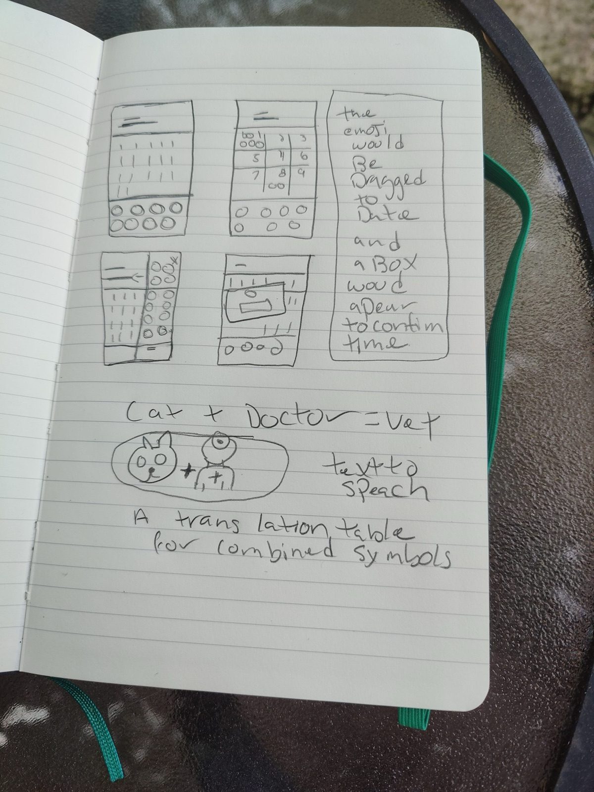
My sketches worked the idea out on paper before any screens: “the emoji would be dragged to date and a box would appear to confirm time.”
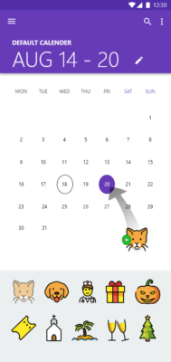
The final flow keeps her paper habit intact. A tray of symbols sits at the bottom of the screen: cat, dog, doctor, gift, church, beach, and so on. She drags one onto a day, and a dialog asks only one thing: what time? The hours are large buttons, a sun and a moon stand in for AM and PM, and a green check confirms it.


The sketchbook also held ideas that didn’t make it into the mockups: combining two symbols into a new meaning, cat + doctor = vet, and reading events aloud with text-to-speech. Both still seem right to me, and both are bigger than they look.
Decisions I'd defend
- Drag to a date, not a form
- Dropping a symbol on a day is the same gesture as drawing on a paper calendar. A form would have asked her to read labels and fill in fields.
- A palette of symbols, not a search box
- Search needs typing, and typing needs reading. The symbols sit in a tray at the bottom of the screen, always visible.
- A sun and a moon instead of AM and PM
- The one part of the time picker that would otherwise need words became two pictures.
- Numbers stayed
- Dates and times are still numerals. A paper calendar already asks her to recognise them, so replacing them would have added a new thing to learn.
Where it landed
emojiCal stayed a concept: a set of wireframes and high-fidelity mockups for Android. Three things came out of it that I still use:
- A writing system made of pictures needs a lot of pictures. A handful of icons covers a demo, not a life. Designing the icon set could have been a project of its own.
- I underestimated the icons. I planned for layouts and flows. The real work was the vocabulary.
- Existing UI kits and resources make ideas shareable fast. Building the mockups from them let me spend my time on the problem instead of the chrome.
The next steps I planned were larger icon sets, possibly a marketplace for them, sharing events with family, and learning Android Studio so my grandmother could actually use it.
What I’d do differently
Recruit wider, earlier. One participant made the design deeply specific and impossible to generalise. Today I’d look for participants through adult literacy programs, senior centres, and ESL classes, before committing to a layout.
Start from an open emoji set. Instead of treating the icons as something to draw, I’d begin with an existing open set and spend the effort on which symbols matter and how they combine.
Audit every remaining word. The header and weekday labels in the mockups are still text. They’re not needed to add an event, but in a product for someone who can’t read, every label is a question worth asking.